Boatur (IOS Mobile App Redesign)
Duration
May 19, 2025- June 23, 2025
Key Skills
Competitive Analysis, User Testing, Wireframing, Hifi Screens, Prototyping
Designed to provide people with a streamlined boat rental and hosting experience allowing renters to enjoy time spent on the water and hosts to confidently list their vessels for an extra source of income.
Company Overview
Boatur is a mobile and web application that connects boat owners with renters based in the US that promotes enjoying the experience of being on the water for everyone.
01- Objective
As a UX designer working for Boatur, my goals were to redesign the experience, interface, and assets to improve the user flows, make the app easy to use, and create a simple and clean design aesthetic before its full launch to the public.
02- My Role
I worked with 3 other interns and the app owner to fully redesign the IOS mobile app. I was responsible for competitive analysis, user testing, and design.
03- Competitive Analysis
Understanding our competitors and the way they solve similar problems helped me as a designer to recognize what could be improved and enhanced on our app. We researched Boatsetter, Get My Boat, Airbnb, and Vrbo.
04- Strengths
Boatur has a strong emphasis on hosts allowing them to have full control over pricing, renter approvals, and availability of their boats.
05- Weaknesses
The app at the start of the project could use updated UI improvements and some of the user flows could be divided into multiple screens for a more streamlined and easy to use experience.
06- Opportunities
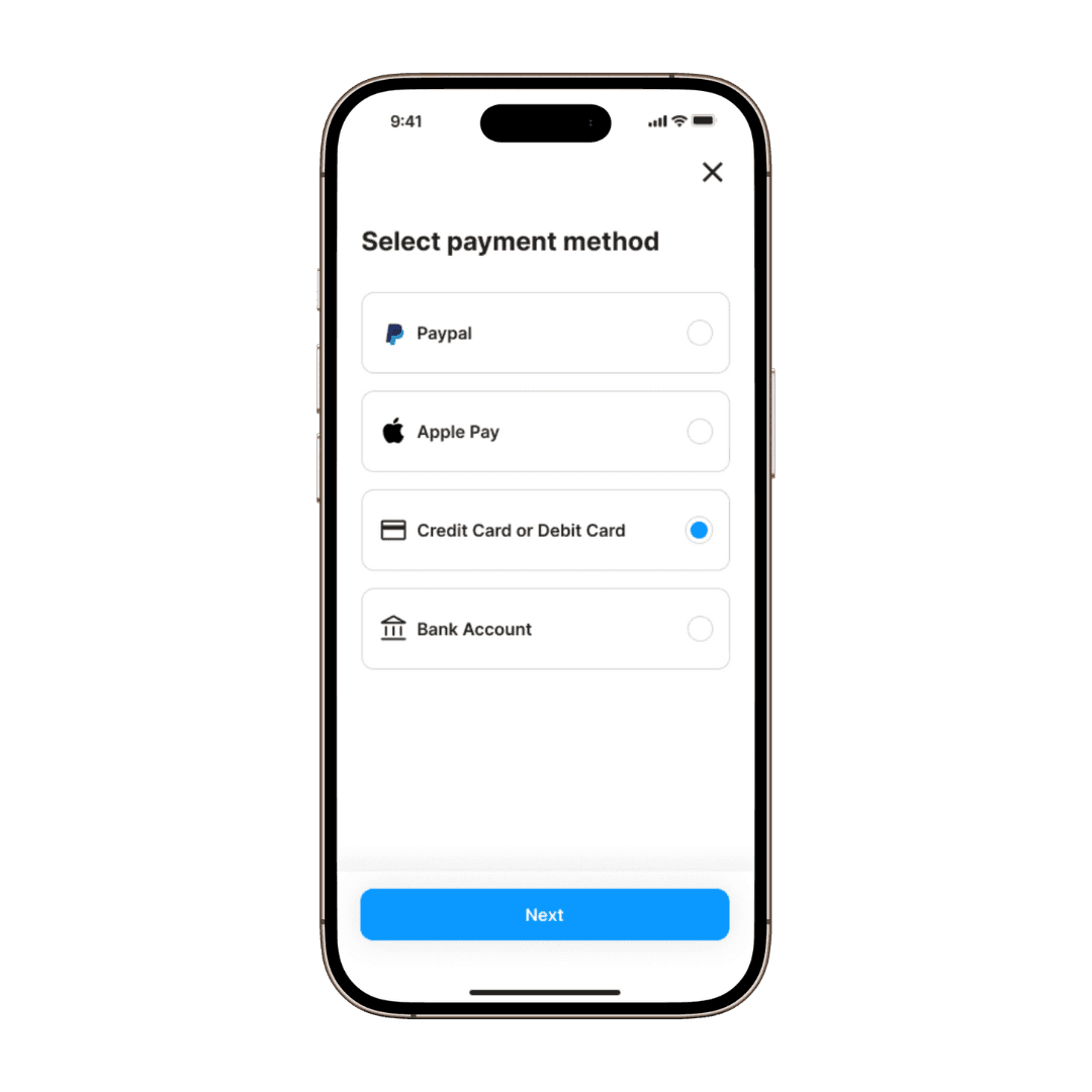
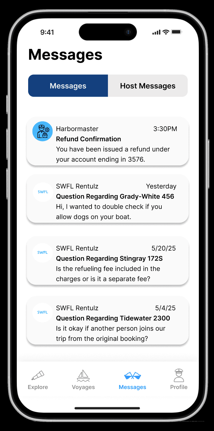
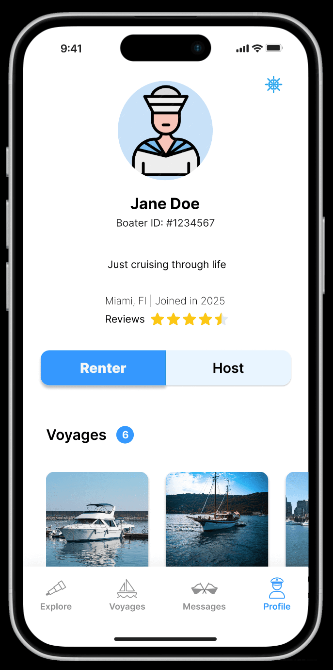
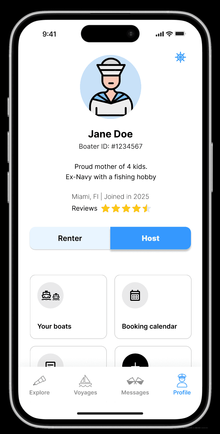
The app could benefit from a host dashboard where hosts can access all of their important information, an intuitive boat rental user flow, and added features such as multiple payment options, login options, and tabs on the messages and profile pages to distinguish between hosts and renters.
07- User Testing
Twelve user tests were conducted on the original to uncover user pain points, navigation difficulties, and current strengths.
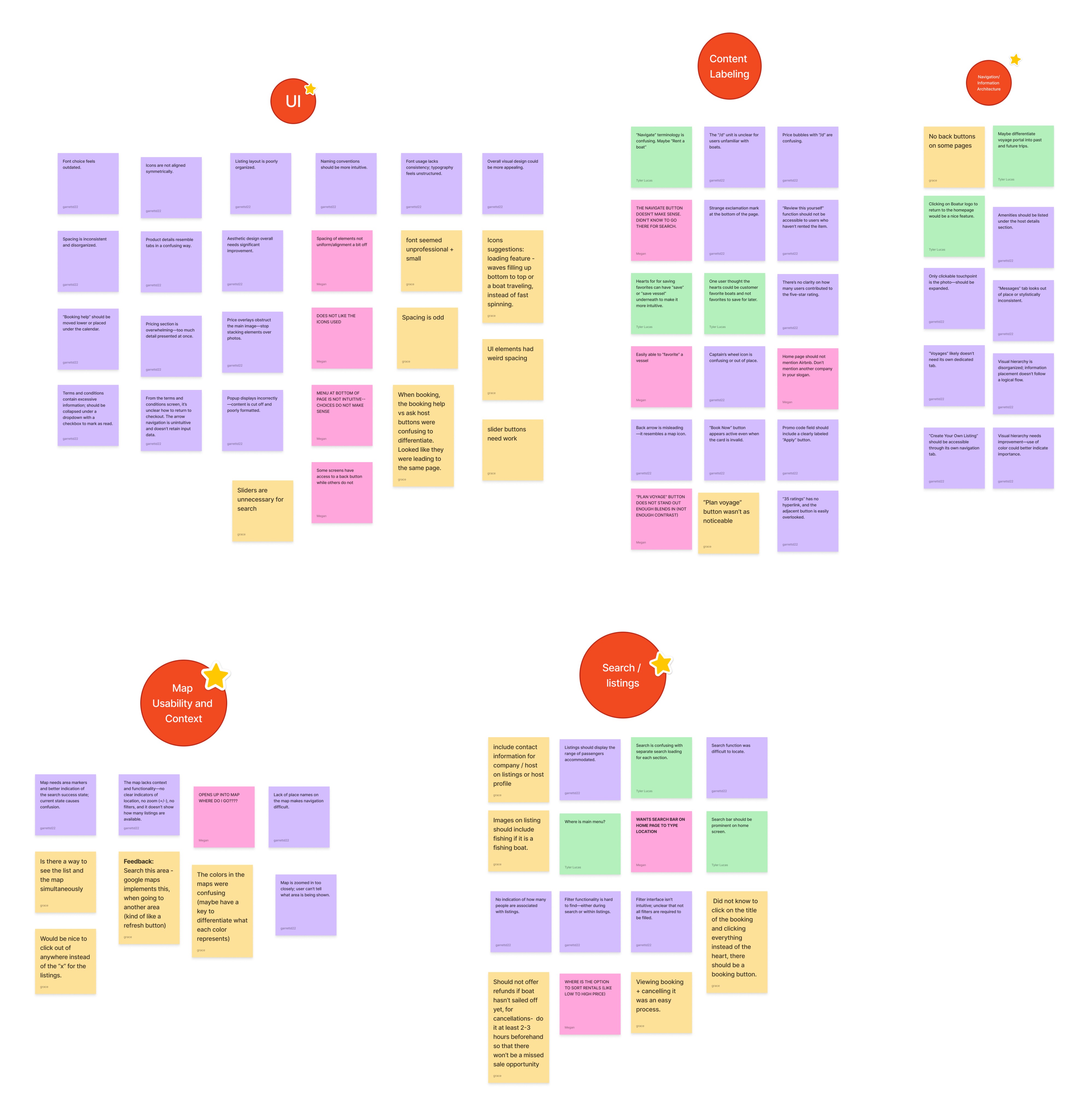
08- Affinity Map
User feedback from the user tests was grouped into categories including UI, content labeling, navigation/information architecture, search/listings, and map usability in order to synthesize the major areas that users had difficulties with.
09- Insights
Users noticed general layout and spacing issues.
Users thought that when entering the app, they should be brought to a home page for renting a boat rather than their profile page.
Some of the nautical verbiage of the app confused users (ex: most users did not know that the “navigate” tab was for browsing boat listings).
The “Plan Voyage” button was not clear to all users as the main way to start their rental search, and the button blends in with the background making it hard to find.
They wanted the ability to sort by price, rating, etc. when viewing a list of options.
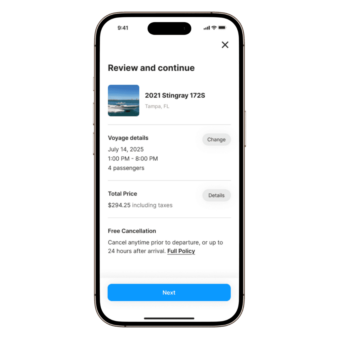
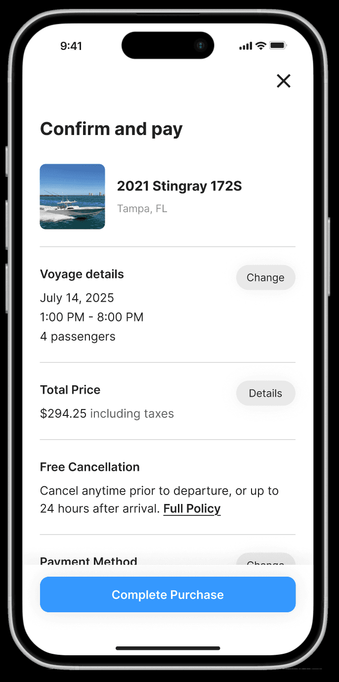
Users felt that the checkout process was too cluttered and should have its own dedicated screen.
They felt that the login process was simple.
Users thought that the option to list a vessel for hosts should be more prominent and not hidden under a drop down menu.
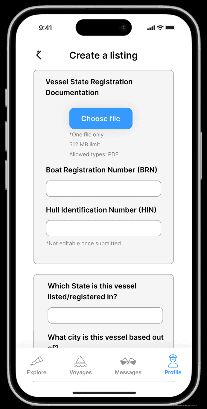
Users felt that listing a vessel was a simple and easy process.
10- How Might We Questions
Based on user insights we developed a group of how might we questions to help guide our design process and solutions moving forward.
How might we improve the clarity and intuitiveness of navigation and labeling to help users find and book boats more easily?
How might we redesign the UI and visual hierarchy to create a more appealing, consistent, and professional look while enhancing usability?
How might we make pricing information and booking details clearer and less overwhelming, ensuring users understand costs and actions without confusion?
How might we enhance the map and search functionality to provide better context, easier filtering, and more useful visual cues for users exploring boat listings?
How might we improve the consistency and accessibility of interactive elements (buttons, icons, back navigation) to reduce user errors and frustration during the booking process?
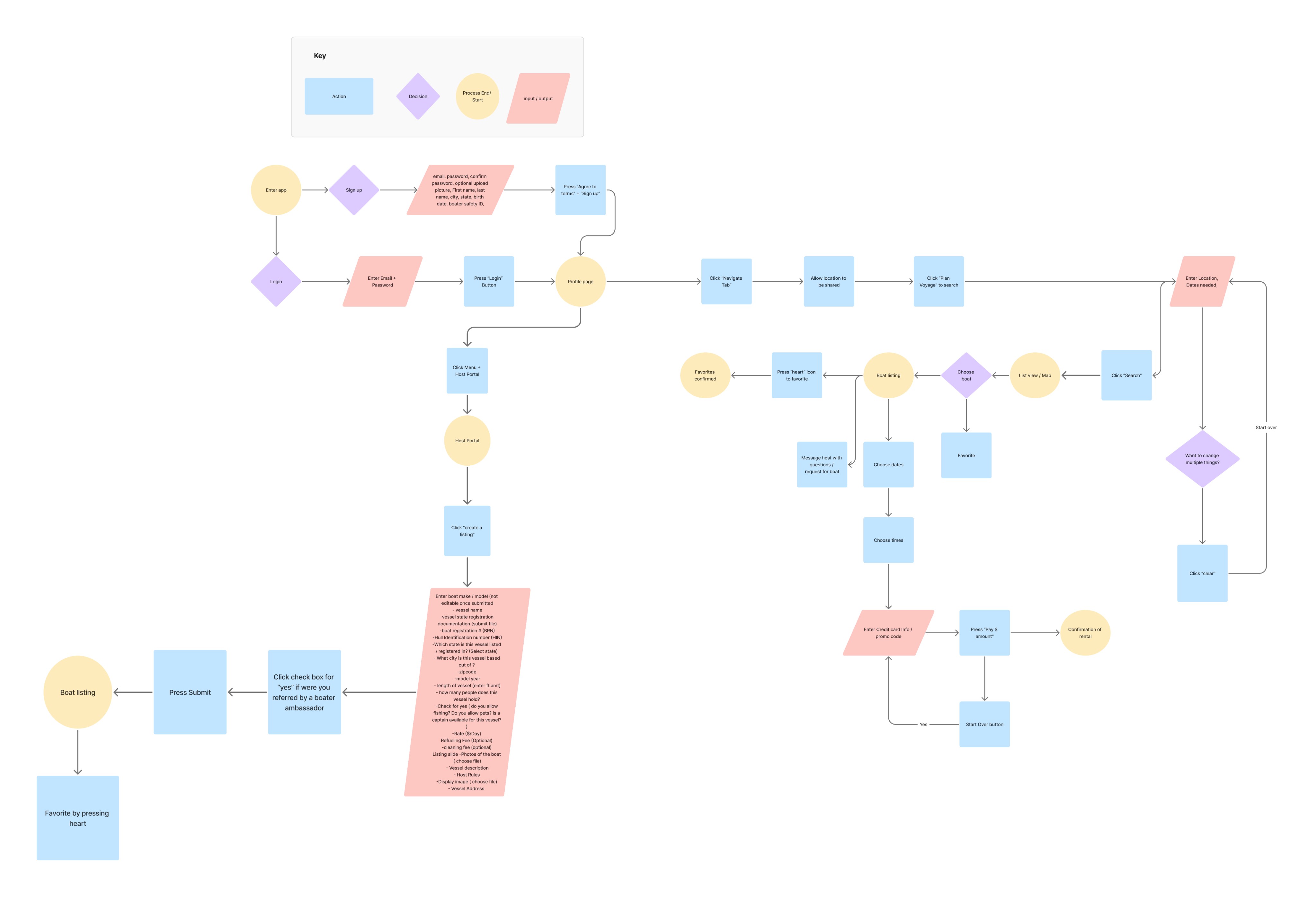
11- User Flow
This diagram was created to show how the user would navigate through the app and accomplish tasks that are important to them such as renting a boat for renters and listing as boat for hosts.
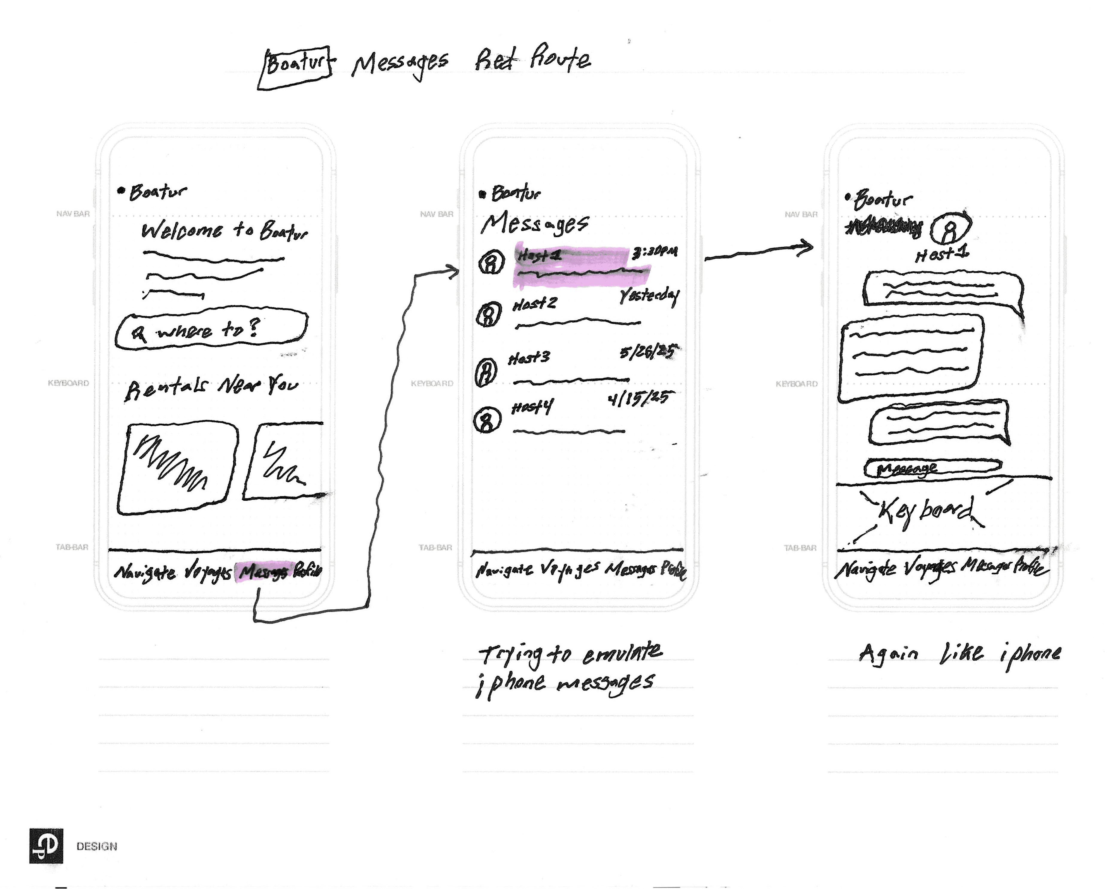
12- Sketches
Sketching screens allowed me to quickly come up with many ideas with a creative flow before committing them to Figma.
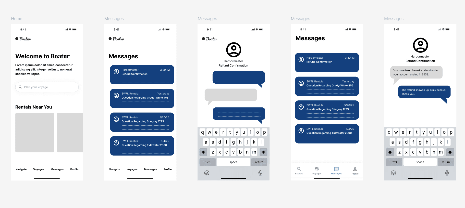
13- Wireframes
I helped create semi-low fidelity wireframes to propose new product design changes based on user testing and the user’s wants and needs.
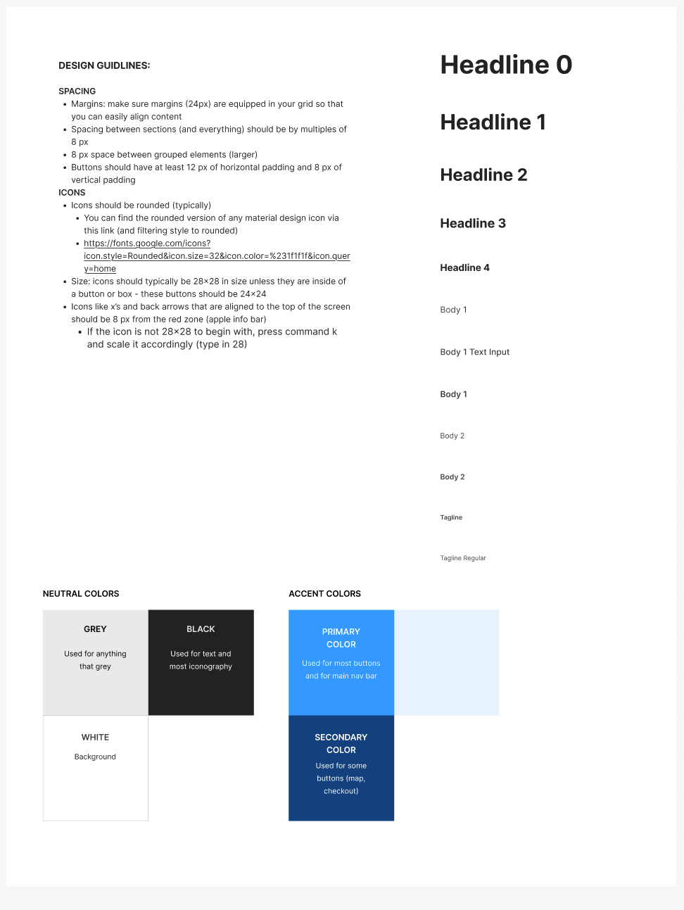
14- Style Guide
Creating a new style guide based on some of the colors, icons, and typography of the app owner’s original app helped my team standardize the design elements we were using for the wireframes and high-fidelity screens so that our designs were consistent.
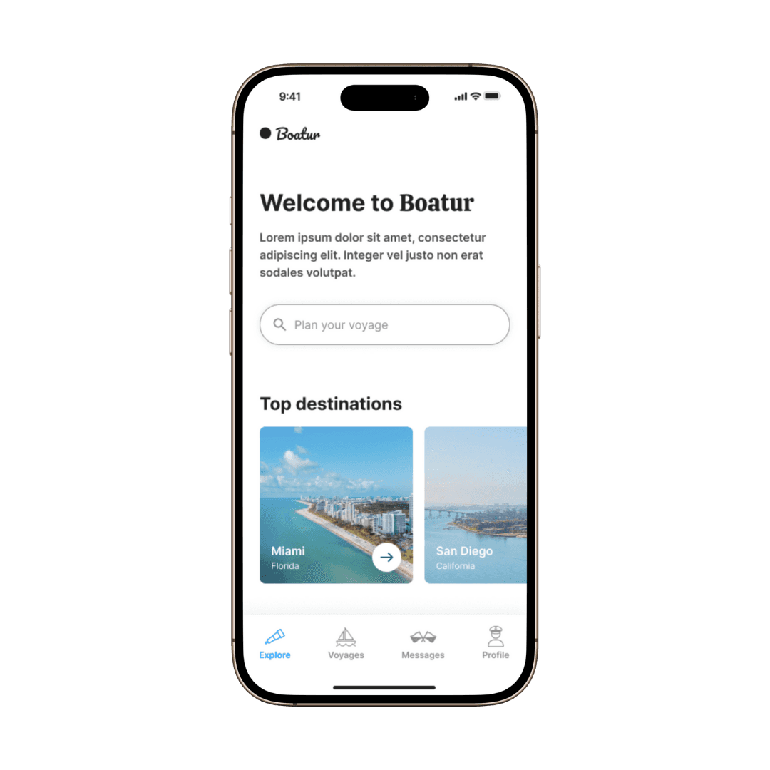
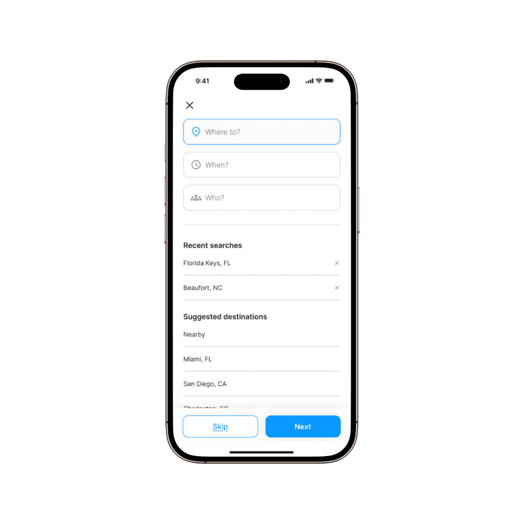
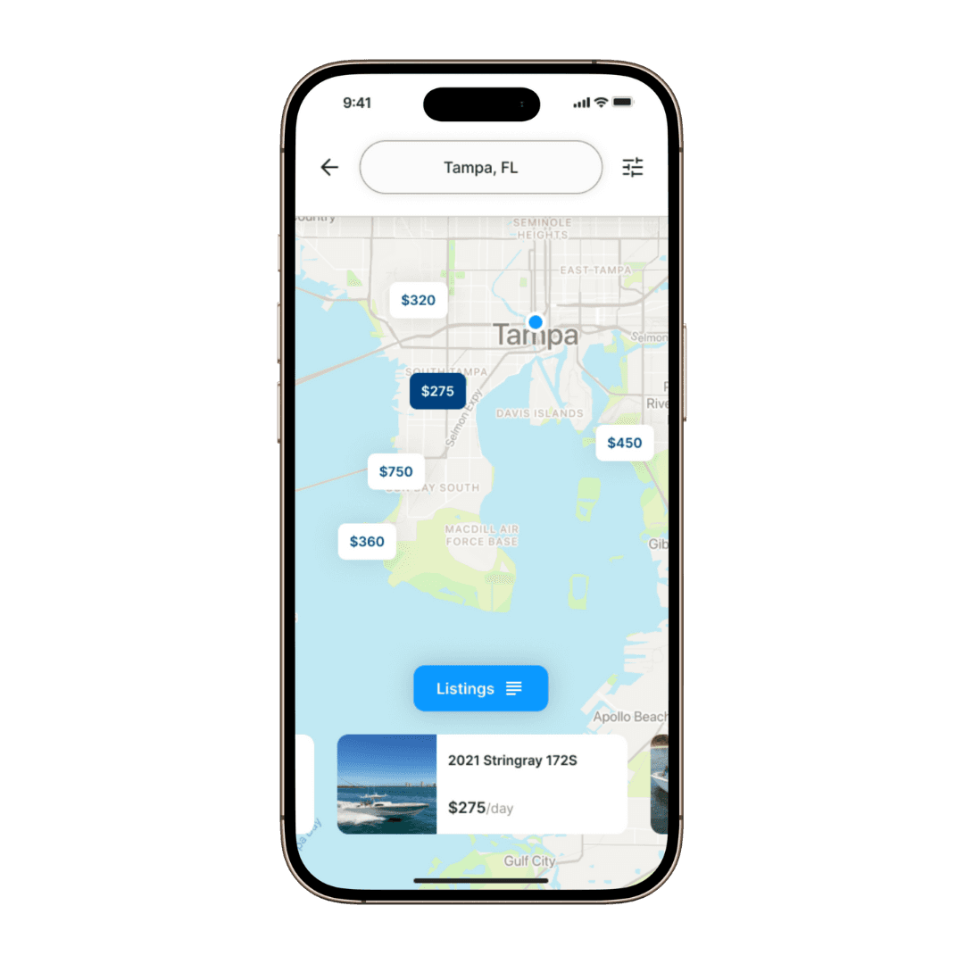
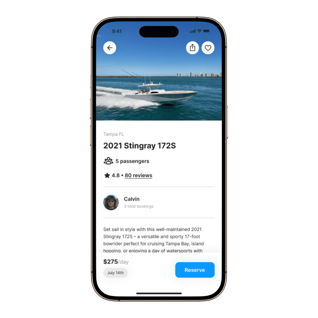
15- Prototype
After creating multiple versions of the semi-low fidelity wireframes, we created high-fidelity screens. We then created a prototype in Figma to display how the app would look and function.
Link to prototype:
https://www.figma.com/proto/WSBQTiNKOcl09Q3xYh7uMr/Springboard-IDP---Boatur?node-id=364-3078&t=G0s5RmIIJx8vA9eo-1
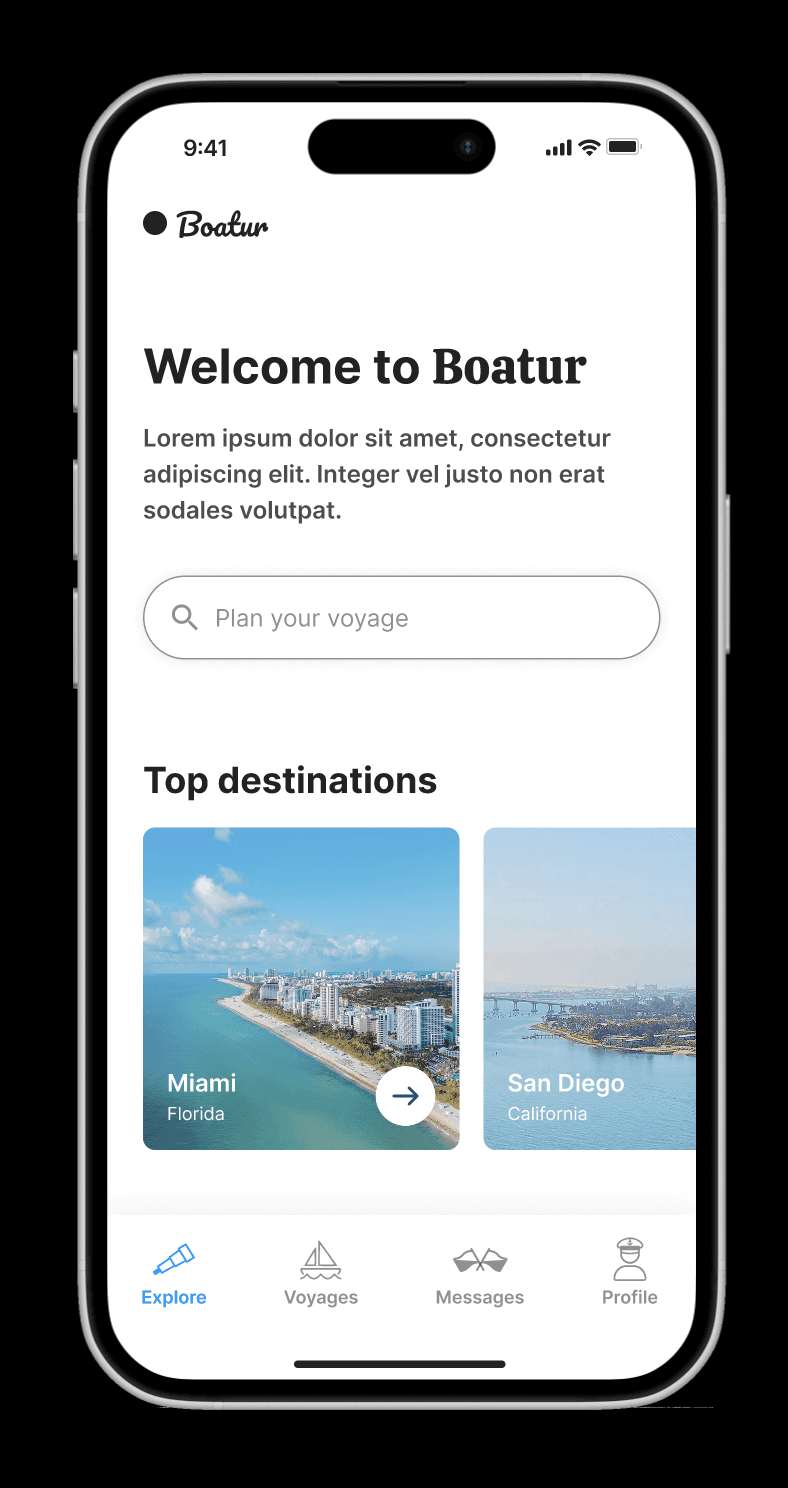
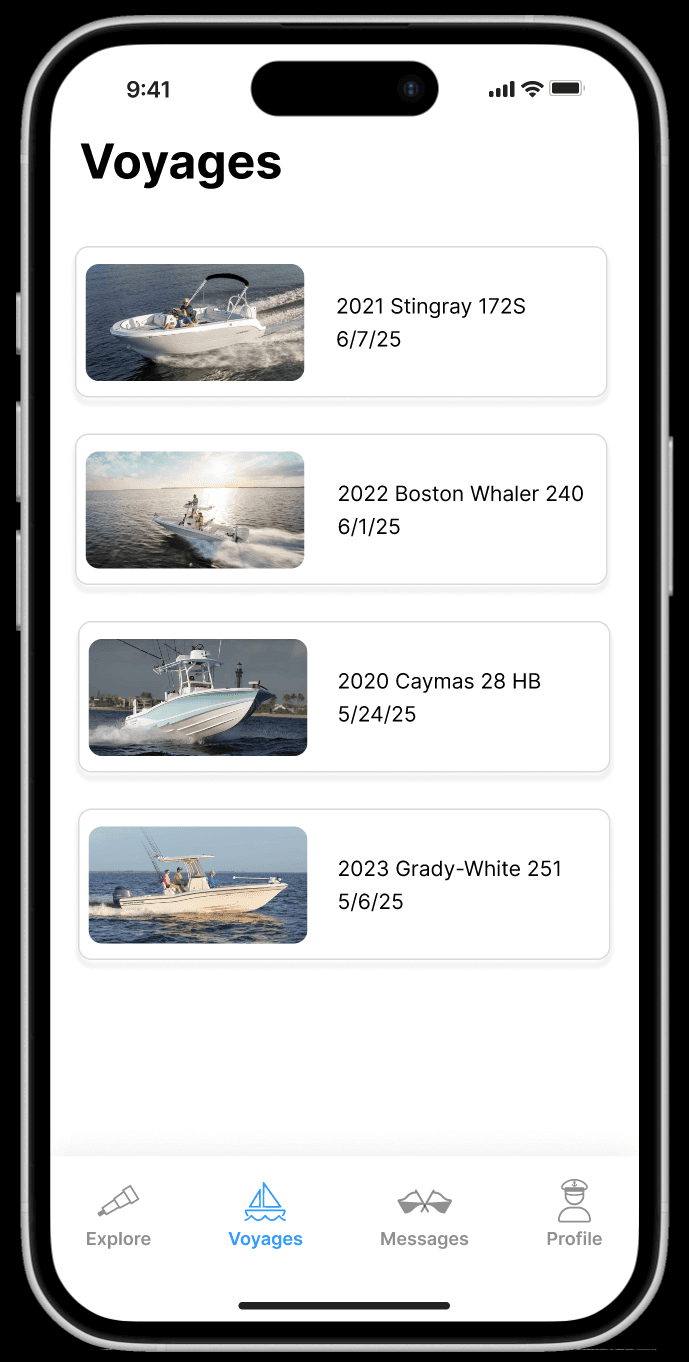
16- High Fidelity Redesigns
17- Impact
The app owner will be implementing our designs over multiple version releases of the app now with a user-focused and streamlined design.
18- Key Learnings
The importance of collaboration while keeping the user at the forefront.
I learned how to work with a team, bounce ideas off of each other, and divide work appropriately based on our strengths while always maintaining user feedback, suggestions, and needs as the basis for our design decisions.